Presentation of microscopy images#
What is it?#
Microscopy images are often shown in scientific papers to illustrate a particular conclusion. While qualitative conclusions are not a substitute for quantitative comparisons (see next section), images can certainly guide our reasoning and our conclusions. Following a few consistent best practices ensures that these conclusions are correct and robust.
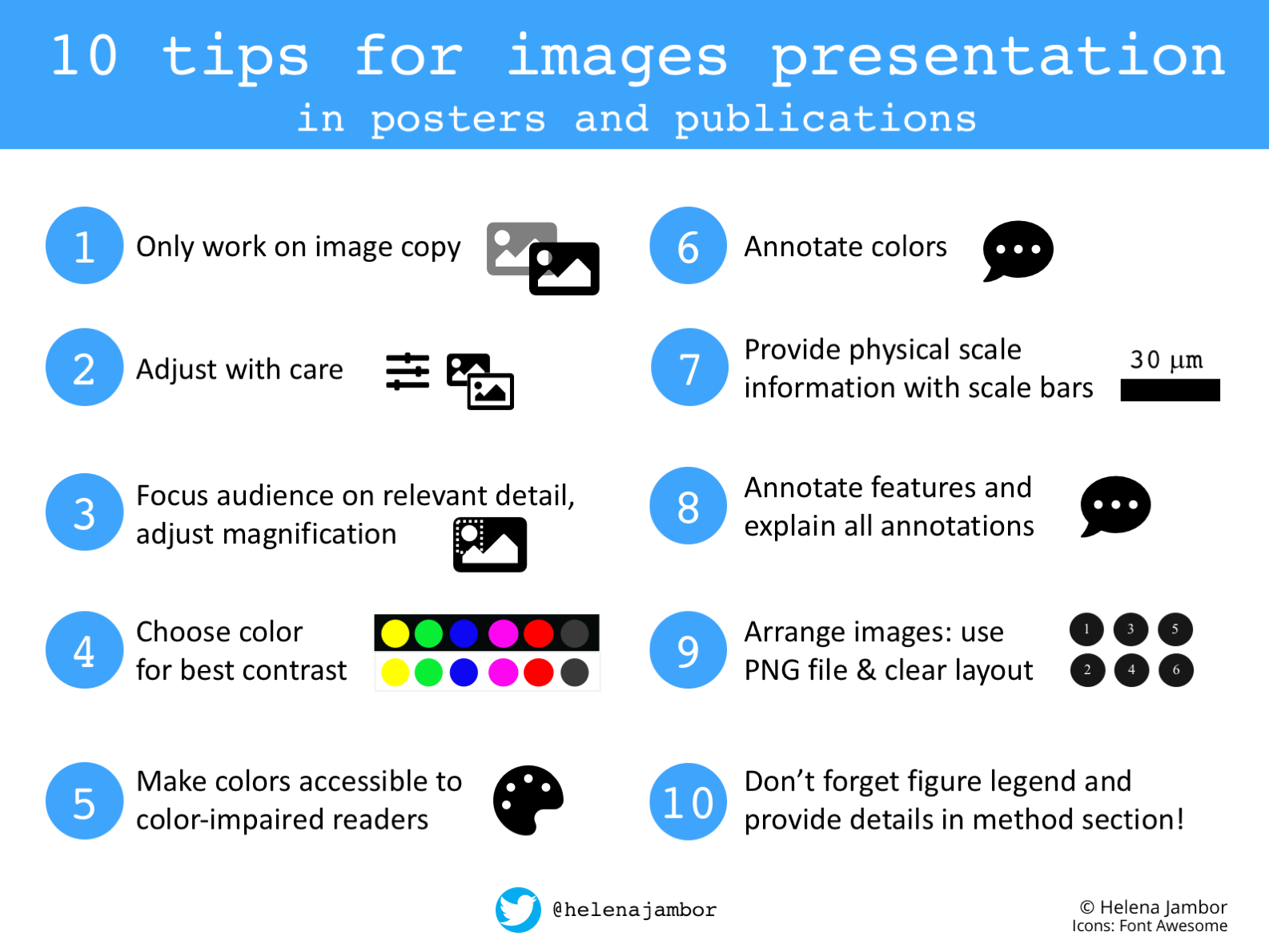
Fig. 9 A brief visual summary of image presentation tips. Figure by Helena Jambor. Source#
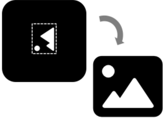
Adjust the image crop, orientation, and size.
For any adjustments, work with an image copy and do not alter the original file. Note, do not use adjusted images for quantitative image data analyses Adjustments to effectively communicate the image content may include removing uninformative image regions (crop), changing the image orientation, and adjusting the size. Note that rotation and re-sizing may change the image data when pixel information is redistributed.
🤔 How do I do it?
See the cheat-sheet below for more information.
⚠️ Where can things go wrong?
Any adjustments that alter the conclusions are not permitted.
Enhance visibility of image content
Images often do not have regular spaced intensity values. To still display the data visible on a screen/in a figure, adjustments of brightness and contrast are usually necessary.

🤔 How do I do it?
See the cheat-sheet below for more information.
⚠️ Where can things go wrong?
Any adjustments that result in the disappearance of image details are considered misleading 50. Note that many nonlinear transformations of brightness and contrast are available in image processing software, before using these users should ensure that they faithfully represent the data to avoid accidentally misleading audiences and disclose them as annotations.
📚🤷♀️ Where can I learn more?
Use accessible colors
Fluorescent microscope images are often composed of data from multiple wavelengths/color channels. To best visualize molecular structures, individual channels can be shown in separate grayscale images. When colors are chosen to represent the illumination wavelength (blue, green, red, far-red), for example Green-Fluorescent Protein is shown in green color, be reminded that intensity values on a black background reduces the level of detail.
When channels are over-laid in ‘composite’ images, authors should ensure that structures are visible, i.e., that the overlay does not obstruct features and that the colors used are clearly distinguishable.

🤔 How do I do it?
See the cheat-sheet below for more information.
⚠️ Where can things go wrong?
For composite images consider if color combinations are accessible to color-blind audiences (e.g. not combine red with green, but rather magenta and green, see reference below for examples) and possibly additionally show individual channels in grayscale for maximizing accessibility and detail. Tools for color blindness simulation of the images exist in image processing software (ImageJ/Fiji) and visibility of colors in final image figures can be tested with applications such as ColorOracle.
📚🤷♀️ Where can I learn more?
Annotate key image features
Each image needs a reference to its physical dimensions. This is typically achieved by including a scale bar with dimensions annotated in the image or the figure legend.
In addition, authors should remember to annotate the colors used, any symbols and arrows used to guide readers, and, if used, the origin of any zoom/inset. If specialized images are shown (time-lapse, volumes, reconstructions) authors are encouraged to consider annotating important information in the figures.

🤔 How do I do it?
See the cheat-sheet below for more information.
⚠️ Where can things go wrong?
Lack of details and missing of key explanations will make it impossible for audiences to interpret image data in figures. To unambiguously reference probes consider using terms from the ISAC Probe Tag Dictionary, a standardized nomenclature for probers used in cytometry and microscopy.
Explain the image
To rapidly orient audiences, a minimal explanatory text should be presented along with images. This includes the figure legend and the methods section in scientific papers or the title of figures in posters and slides. Consider using a controlled vocabulary to reduce ambiguity and increase machine-readability of the descriptions of specimens, tissues, cell lines, and proteins etc. A useful tool is the RRID (Research Resource Identifying Data)index , which provides indices for commonly used biological reagents and resources, e.g., plasmids, cell lines and antibodies .
🤔 How do I do it?
See the cheat-sheet below for more information.
⚠️ Where can things go wrong?
Missing explanations of image details/methods may result in non-reproducible data and limits the insights from the data.
📚🤷♀️ Where can I learn more?
📄 Replication Study: Biomechanical remodeling of the microenvironment by stromal caveolin-1 favors tumor invasion and metastasis 53
📄 Imaging methods are vastly underreported in biomedical research 54
📄 Are figure legends sufficient? Evaluating the contribution of associated text to biomedical figure comprehension. 55
Where can I learn more?#
Check out Creating clear and informative image-based figures for scientific publications51 and Community-developed checklists for publishing images and image analysis56 for more tips and best practices for making image figures.
A cheat sheet on how to do basic image preparation with open source software:
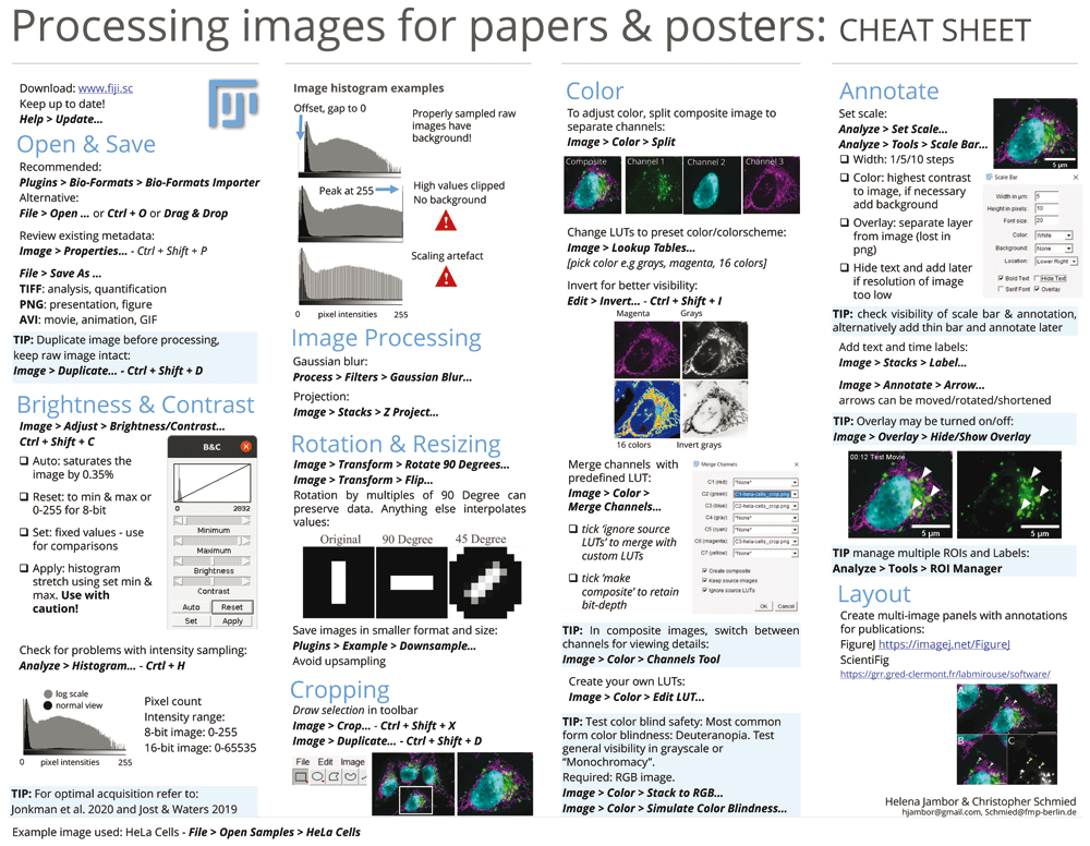
Fig. 10 How to correctly perform various image manipulations in Fiji. Figure by Christopher Schmied and Helena Jambor. Source#